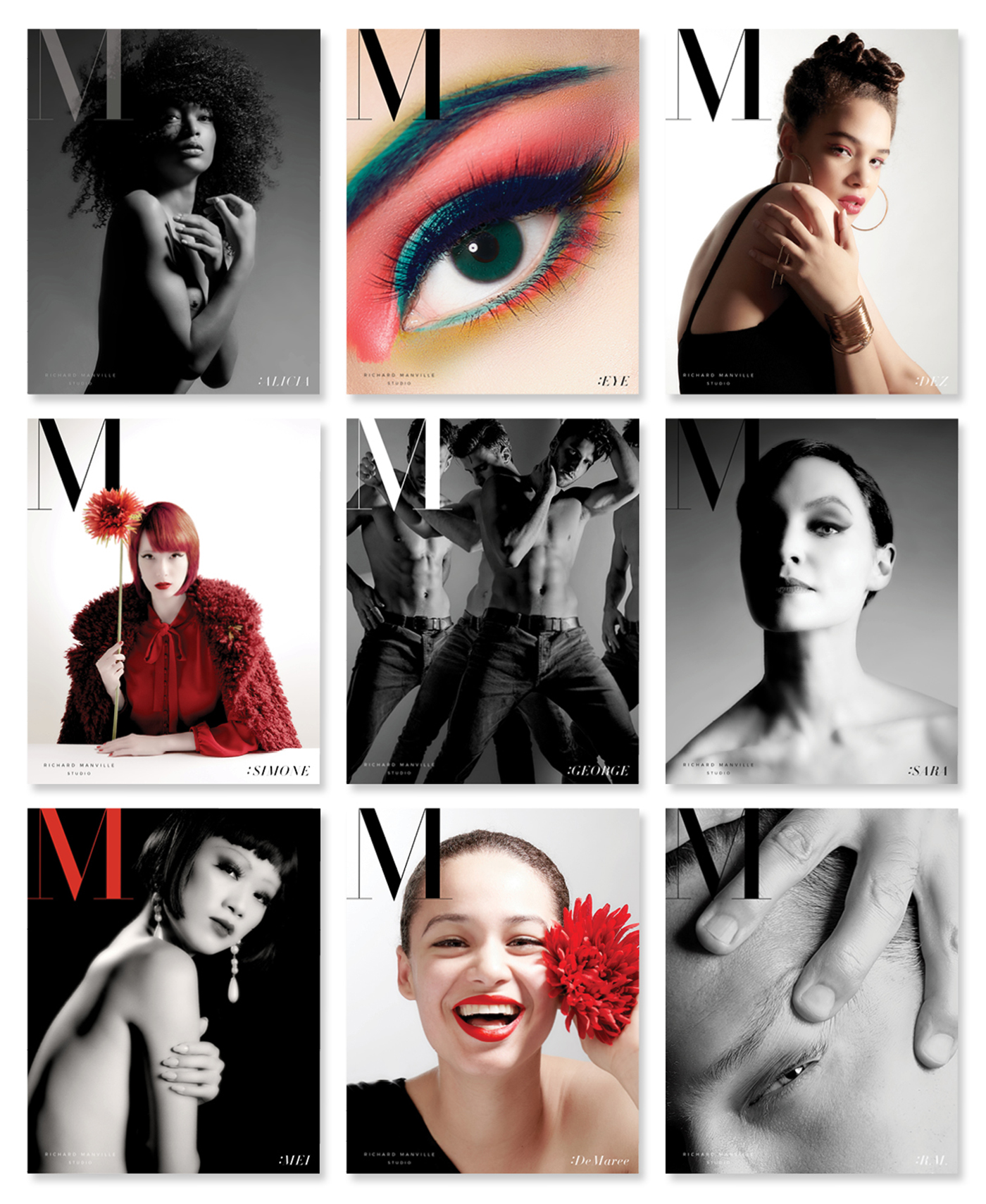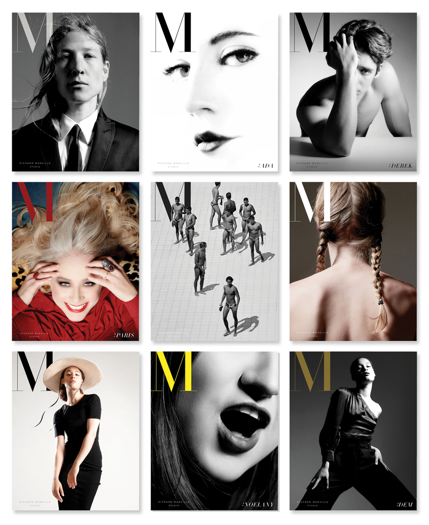
Project: Self-Promotion Card Series featuring Photography Work
Services Provided: Photography, Styling, Design
One of my favorite pastimes as a student at Parsons was spending hours looking at bound volumes of Vogue and Harper’s Bazaar magazines from the 40’s, 50’s, and 60’s. I developed a great affection for the aesthetic of the magazine cover. Something about the combination of my favorite things…fashion, art, photography, typography, and logo design… all together in one image just feels right. Unlike many photographers, as a designer and creative director, it’s impossible not to see a photograph in a context of some kind that includes typography.
When considering presentation of my own photography, I couldn’t resist showing it in the format I love. A magazine cover. My “magazine”, “M” (initial for Manville, of course), is in the form of a large card.
