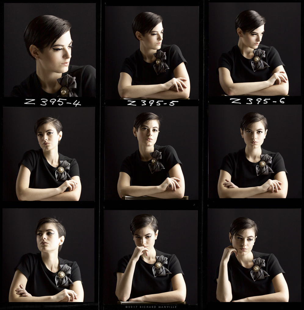
Being based in Hollywood has its advantages.
This town is filled with beautiful people and if you’re lucky you get to work with people as lovely inside as out. Among the lovely ones, Katy Erin is a young actress and model that I had the opportunity to photograph in studio.
I asked Katy to sit for me to experiment with a series of images that would play with gender style featuring R.B.Manville silk pocket squares. Katy’s naturally impish androgynous qualities were perfect for the range of looks I was going for.
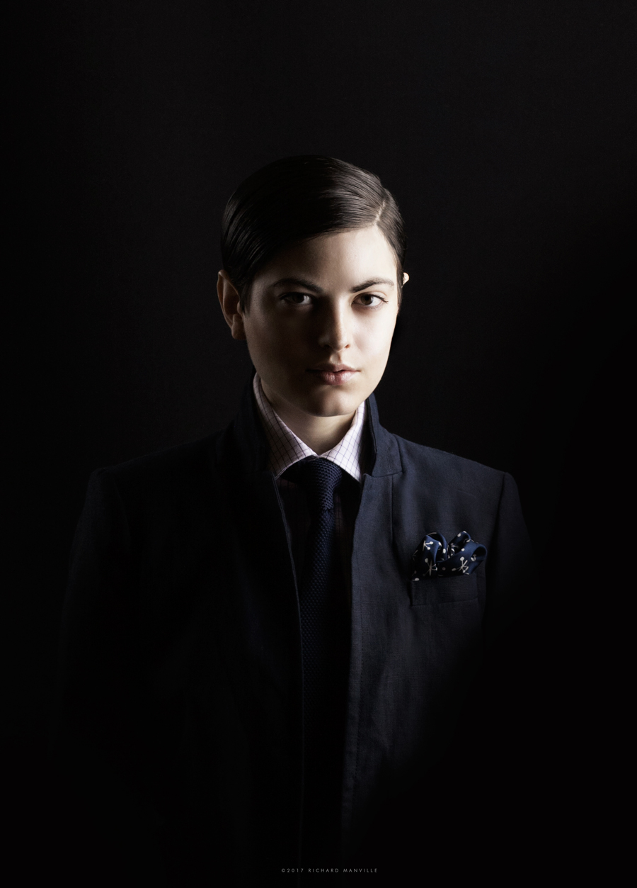
We had limited time (just a few hours) to attempt as many looks as we could squeeze in. So we started with the more boyish looks first and then makeup artist Perla Lizarraga progressively added shades of femininity with makeup and hair along the way; from School boy style to Jazz-age androgyny to a new wave-ish pompadour.
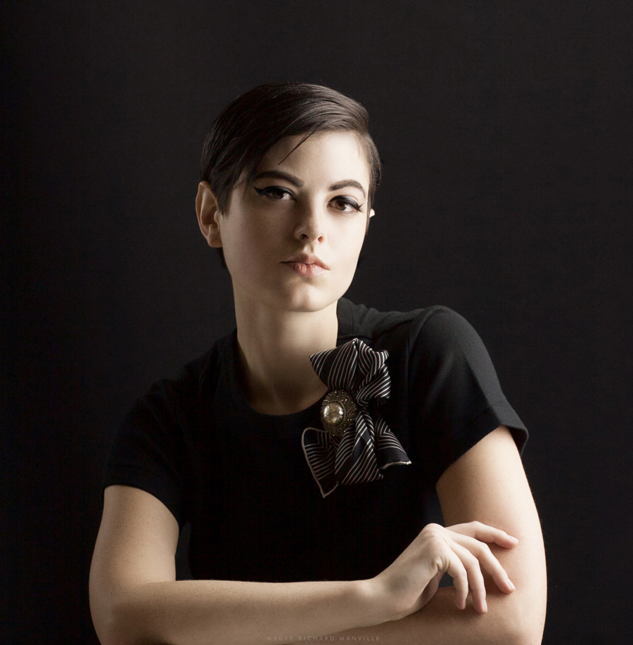
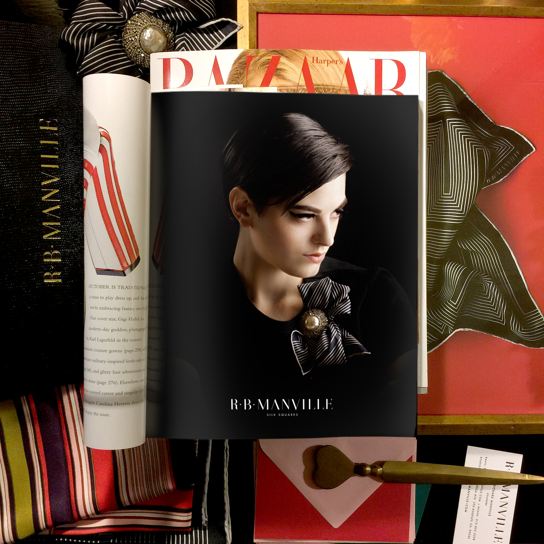
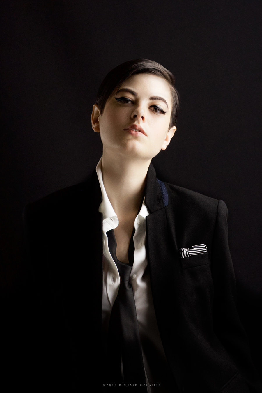
So, the reason for this shoot was to experiment with imagery for R.B.Manville.
R.B.Manville is a collection of silk squares primarily marketed as men’s pocket squares. The creation of R.B.Manville as a concept, was intended to be a collection of gift-able art/fashion pieces featuring original print designs created by the studio.
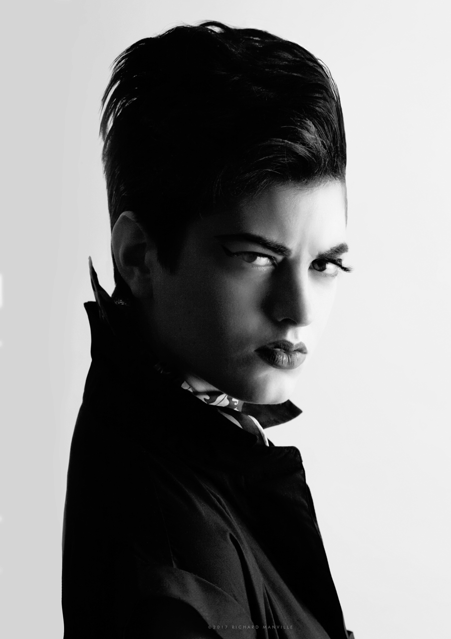
The brand was launched during the height of a bespoke dandy movement in men’s fashion. The collection was intended to fit into a very select niche of the fashion/design connoisseur. Although primarily marketed as a men’s accessory, the brand’s venturesome style had received more attention and appreciation from not only a sophisticated male buyer, but a fashion forward female audience. We believe it has been mostly women buying for men. However another relevant trend of menswear for women was emerging at the same time.
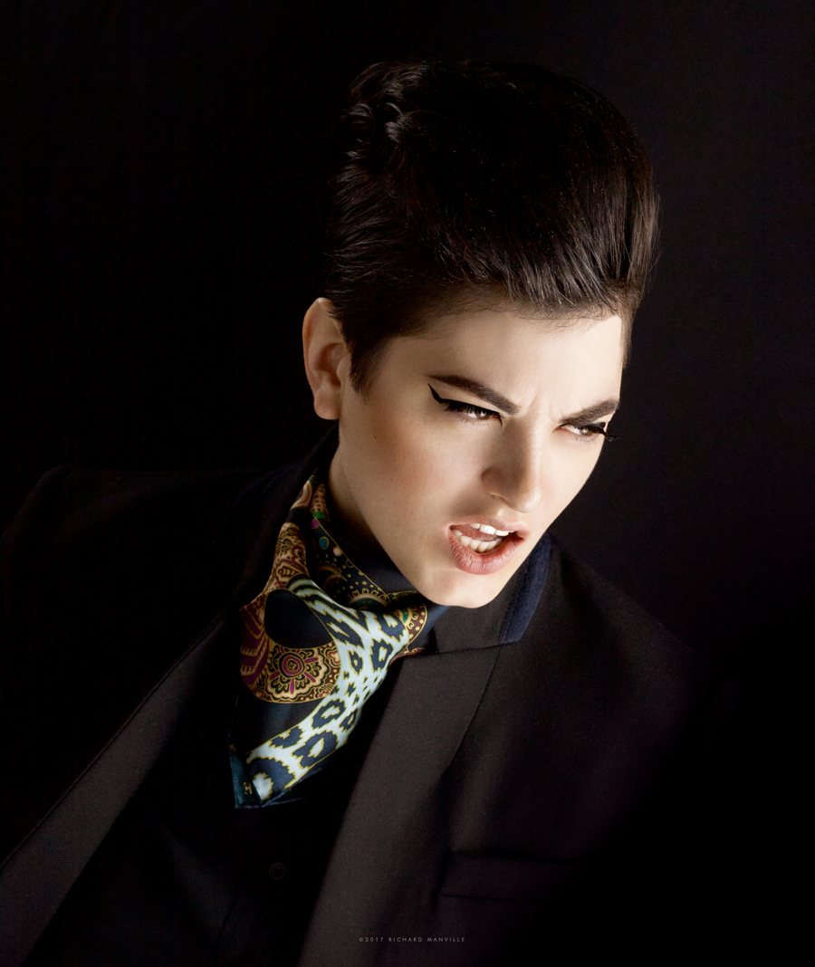
The imagery for the brand, at its inception, was more neutrally product focused. As I began to think of the next phase, taking a more fashionable approach to the photography was a natural progression but felt that featuring men in pocket squares was a bit too “on-the-nose”. Social media has also created a big demand for more brand imagery and has forced many brands to be more visually prolific. So experimenting was well worth the time and lots of fun. I was really happy with the result and grateful to Katy and Perla’s contributions and beautiful collaboration.